
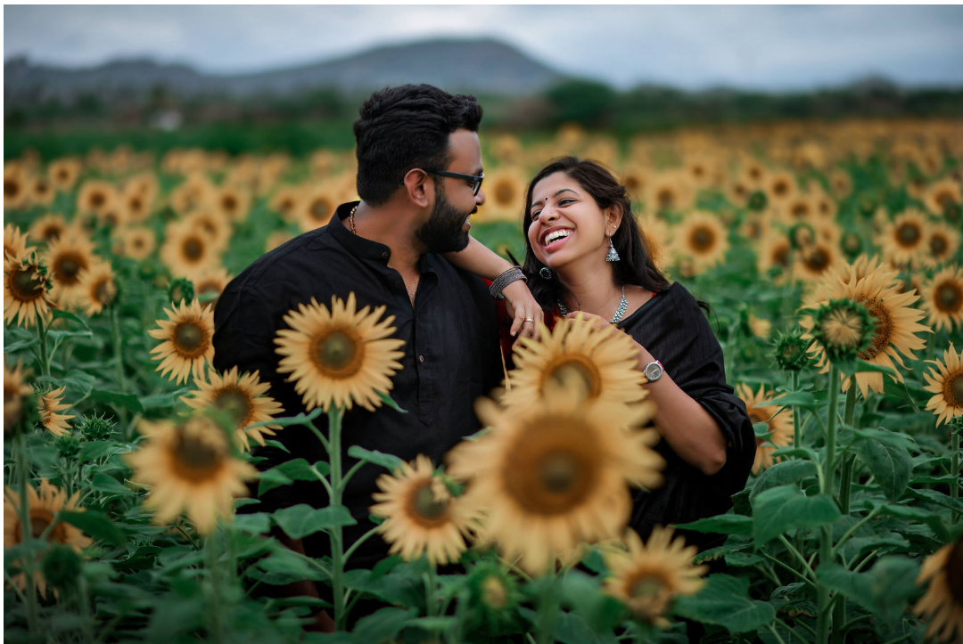
The colours you choose for your wedding will influence how your photographs look and feel for years afterwards. A good palette gives your album one steady mood from the morning rituals to the evening reception, while an unbalanced choice can flatten details or shift under different lights.
Pastels, neutrals and bold traditional shades all react differently to your venue, outfits and decor. Knowing how they behave helps you pick colours that look right in the room and just as right in the photographs
Why Choosing the Right Wedding Colours Matters for Photography
Wedding colours are important for photography, as they help create the tone of every shot. A soft palette feels calm and romantic, while deep, rich shades feel dramatic and celebratory.
A palette also carries the story of the day. When two or three colours repeat across outfits, flowers and decor, the album feels like one connected story.
What looks beautiful in the room can look different in a photograph, so it helps to plan your colours with the camera in mind.
Best Wedding Colour Combinations That Look Beautiful in Photos
The most successful combinations balance contrast and harmony, helping each element remain visible in photographs. Pastels, neutrals and bold traditional shades all do this well.
Pastel Wedding Colours for Soft and Romantic Photos
Blush, lavender and pale mint photograph softly and create a gentle look in natural light. They work best in open shade and morning light. Adding one broader accent, such as dusty rose, gives the frame more depth.
Neutral Wedding Colours for a Luxury and Timeless Look
Champagne, taupe, and warm beige create a clean, timeless look that keeps attention on the couple. Silk, lace, and brocade add texture so the palette does not look flat. Pure white can lose fabric detail in the bright sun, so softer off-white shades are easier to photograph.
Bold and Traditional Wedding Colours for Dramatic Wedding Photography
Deep red, emerald, and mustard look striking when the fabrics are rich and the light is soft. This group includes traditional Indian colours, from bridal reds to silk sarees and the Kerala kasavu.
The white and gold tones of kasavu look great against the natural greenery of Kerala, creating photos that feel rooted, traditional, and timeless. Strong reds need controlled light, since harsh sun can flatten the zari work and fine detail.
Trending Wedding Colour Palettes for Modern Weddings
Modern wedding colour palettes often combine timeless shades with current trends. Ivory and gold create an elegant luxury feel, sage green and peach work beautifully for outdoor celebrations, burgundy adds depth to evening weddings, and blush tones create soft romantic photographs.
The key is not choosing a colour because it is trending but selecting a palette that complements your venue, lighting, and overall wedding style.
Wedding Colour Mistakes That Affect Your Photos
Some colour choices look impressive in person but can cause problems on camera. Knowing them early lets you change your outfits, decor or flowers before anything is bought. Four mistakes come up most often, and each one is easy to avoid with a little planning.
- Neon shades: Fluorescent pinks, greens and oranges tend to glow on camera, and the excess colour can reflect onto skin.
- Extremely bright colours: Very saturated fabrics lose their texture and pattern in photographs, so zari work and embroidery can look flat.
- Clashing combinations: Three or four strong shades competing at once pull attention away from the couple.
- Colours affected by venue lighting: Warm bulbs turn whites yellow or orange, and coloured LED lights can shift an entire palette, so test your shades at the venue at the same time of day.
How Lighting and Photography Style Affect Wedding Colours
Lighting has the greatest impact on how wedding colours appear in photographs. Your eyes adjust naturally to changing light, but photographs capture the exact effect of that light on colours.
Natural light gives the most accurate results, especially in open shade or soft morning and late afternoon light. Indoor lighting varies, since tube lights, warm bulbs and stage lights each add a tint. Flash and stage lighting are used for evening photography, so colours must be planned to ensure consistency.
True-to-colour photography preserves the skin tones, fabrics, flowers and decor as they were on the day. Heavy filters will date quickly, and accurate colour will look right years later, so natural colour is important.
How to Choose the Best Wedding Colours for Photography
Start with the venue’s lighting, then match outfits, flowers and decor to it. Limit the palette to three colours and consider the season. Working with a team experienced in top wedding photography in Trivandrum can show how your palette will appear before the wedding day.
- Venue and background: Pick shades that stand apart from the walls, flowers, and surroundings, so you and your outfits do not disappear into the setting.
- Lighting conditions: See the colours under the lights you will actually have on the day. A shade that looks right in the shop can look quite different in the hall.
- Outfits and decor: Match clothing, flowers and stage design as one set, so nothing looks like it belongs to a different wedding.
- Fabric texture: Notice how each material catches light, since satin, silk and matte cotton all behave differently in portraits.
- Photographer input: Bring your references and swatches to your photographer before you finalise the palette.
How Greenhat Photography Captures Wedding Colours Naturally
An experienced wedding photographer understands colour balance, lighting, and composition and uses them to guide colour choices before the day. When choosing top wedding photography in Trivandrum, review portfolios for natural skin tones, accurate fabrics, and consistent colours across different venues.
Composition helps us choose backgrounds that support the outfits, while lighting decisions, such as selecting open shade over direct sunlight, help preserve natural colours. Consistency ties it together, so the morning rituals, ceremony, and reception all match across the album.
At Greenhat Photography, we focus on capturing weddings as complete visual stories, where colours, emotions, and details come together naturally. We are a Trivandrum-based team covering pre-wedding, post-wedding, candid, and destination weddings, and we edit in-house.
Choose Wedding Colours That Look Beautiful in Photos, Not Just Trending
Trends are a useful starting point, but they should not decide your palette on their own. The best wedding colours are the ones that photograph as beautifully as they look in person, and that usually means shades that suit your venue, your light and your outfits.
Try your options in the space where you are getting married, and ask for a second opinion before you commit. When you are choosing top wedding photography in Trivandrum, pick a team that can guide your colours as well as capture them.
Visit Greenhat Studio or contact us at 9447991164 to book our services.